Overview
My Role
My Team
Dice is a unified design system built to replace 40+ fragmented, brand-specific design libraries previously managed under the Shelby framework. With a focus on scalability, consistency, and efficiency, our team built a global system powered by Figma Variables and design tokens — enabling seamless brand theming and faster product development across all white-label brands.
Design research, System thinking, components Design, Token mapping, conducted educational workshops cross-functional teams, Information architecture, Visual language Defining, ZeroHeight documentation.
Suraj Kumar, ToniAnn Drenckahn, Rajasekhar Dronamraju, Beesu Sagar, Kacey Wood, Gayatri Gaikwad
Problem Statement
Design = Development
Design work across multiple teams, brands, and geographies had become fragmented. Without a shared system, each team built components and patterns independently, leading to duplicated effort, inconsistent UI, and a disjointed user experience. There were no unified libraries, no common design language, and no aligned workflows between design, product, and engineering.
The core challenge was not just creating components, but unifying siloed teams, consolidating scattered assets, and establishing a scalable multi-brand design system that could bring consistency, efficiency, and collaboration across a large global ecosystem.

Dice Design System Universe

Global
Design System

Sports
Design System

Player Experience
Design System

Casino and Gaming
Design System


Contribute


Delivery


Contribute
Delivery


Contribute
Delivery
As we uncovered the depth of inconsistencies and siloed ways of working across teams, it became clear: we didn’t just need a design library – we needed a system that could scale across an entire organization. That’s when DICE was born. DICE is more than a design system – it’s the foundation for how we design, build, and scale consistently across 40+ brands under Entain and BetMGM. But building one design system wasn’t enough. Each product team had its own constraints, audience, and goals. So instead of forcing a one-size-fits-all approach, we built DICE as a system of systems. Think of it like an ecosystem: At the center sits a global design system, defining shared foundations – tokens, components, guidelines. Around it, product-specific systems (like Sports, Gaming) extend and adapt the core to fit their unique needs.
Problem Areas
Inconsistency and Fragmentation
Managing 30+ white-label brands through separate design systems caused visual and functional inconsistencies across products. Each brand’s design library evolved independently, leading to a fragmented ecosystem.

Maintenance Challenges
Having multiple libraries based on the Shelby framework resulted in duplication of effort and difficulty in maintaining or updating components. This made it challenging for designers and developers to collaborate effectively across teams and brands.

Scalability and Design Debt
As new brands were added, the system became harder to scale, slowing down design and development cycles. The lack of a unified system increased the risk of design debt, highlighting the need to consolidate and streamline the framework for efficient brand theming without losing flexibility or individuality.

Project Timeline
Discovery
Define
Design
Delivery

Audit & Research
Evaluating 30+ brand libraries and identifying inconsistencies
Interviews
Gathering inputs to understand workflow gaps
System Foundation
Creating scalable token and theming foundations
Component Prioritization
categorizing components based on usage frequency and impact
Component Design & Build
Creating reusable UI components, tokens ensuring accessibility
Design–Dev Syncs
Collaborating with engineering teams for handoff, testing
System Rollout
Launching the unified multi-brand design system across all product teams.
Workshops & Training
Conducting educational sessions to ensure smooth adoption
Business Goals
Scalable Brand Customization
Enable multiple brands to maintain unique visual identities within one unified system. Provide granular control over component styling to support brand flexibility.
Workflow Efficiency
Simplify component and semantic structure to streamline design and development. Reduce duplication, cognitive load, and maintenance effort across teams.
Future Growth & Adaptability
Build a flexible, modular system that scales with new brands and components. Ensure long-term sustainability and prevent rework or technical debt.
Discover
65%
Component Duplication Across Brands
5%
Inconsistent Token and Naming Structure
65%
Fragmented Theming and Lack of Governance
Before initiating the Dice Global Design System, we began with a comprehensive design system audit to understand the existing ecosystem. Our focus was on analyzing 30+ brand libraries built on the Shelby framework, identifying inconsistencies in components, tokens, and theming structures.
We evaluated design patterns, naming conventions, and token dependencies to uncover redundancies and fragmentation across brands. These insights became the foundation for defining a scalable architecture strategy, ultimately guiding the consolidation and migration into a unified system powered by Figma Variables.
Research & Audit
Production


9:14

Design


9:14


1
2
3
4
5
Production


Design


6
7
8
9
Define
After completing the audit, we clearly identified major inefficiencies across the design systems. The team mapped key pain points related to token usage, theming inconsistencies, excessive libraries, and the high cost of manual changes. These challenges formed the foundation for defining the goals of the Dice Global Design System — focusing on logic consistency, scalability, and clarity.
Core Problems
65%
Only 65% of tokens are following the logic of implementation
Est.50hrs
1 week is required to change manually all the components
40+
Too many libraries and design systems Designers and developers can’t get a clear reference for their work.
90%
Defects from designers and devs when applying theming/tokens
Develop
With a clear understanding of the problems and system goals, we entered the build phase — developing a consolidated, flexible design system powered by Figma Variables. The team worked on unifying components, simplifying logic, creating theme-based tokens, and reducing the manual overhead for future updates. This also included validating the system across multiple brands and devices.
Solution
More options
Recently Played Games
Fishin’ Frenzy
Megaways
3m ago
7 Neon Links
Yesterday

The Walking
Dead
12/11/21

Cash Bonana
11/11/21

My Global Jackpot
pin to game scene

content to be defined
Open Tournaments

pin to game scene

unpin to game scene
Feeds
edit

Navigation
edit
Slot
Tournament

Pick a Box

Responsible
Gambling


Global
Jackpot
Coin Flip

My Games

The Wheel

The PrizeGrabber


*Placeholder


Your balance is close to 0

You have got new coin flip!

Got it
Pin the widget to your game scene to keep it on track while you’re playing.

Check and Update the existing applications
With a clear understanding of the problems and system goals, we entered the build phase developing a consolidated, flexible design system powered by Figma Variables. The team worked on unifying components, simplifying logic, creating theme-based tokens, and reducing the manual overhead for future updates. This also included validating the system across multiple brands and devices.
More options
Recently Played Games
Fishin’ Frenzy
Megaways
3m ago
7 Neon Links
Yesterday
The Walking
Dead
12/11/21
Cash Bonana
11/11/21
My Global Jackpot
pin to game scene

content to be defined
Open Tournaments

pin to game scene

unpin to game scene
Feeds
edit

Navigation
edit
Slot
Tournament

Pick a Box

Responsible
Gambling


Global
Jackpot
Coin Flip

My Games

The Wheel

The PrizeGrabber


*Placeholder


Your balance is close to 0

You have got new coin flip!

Got it
Pin the widget to your game scene to keep it on track while you’re playing.


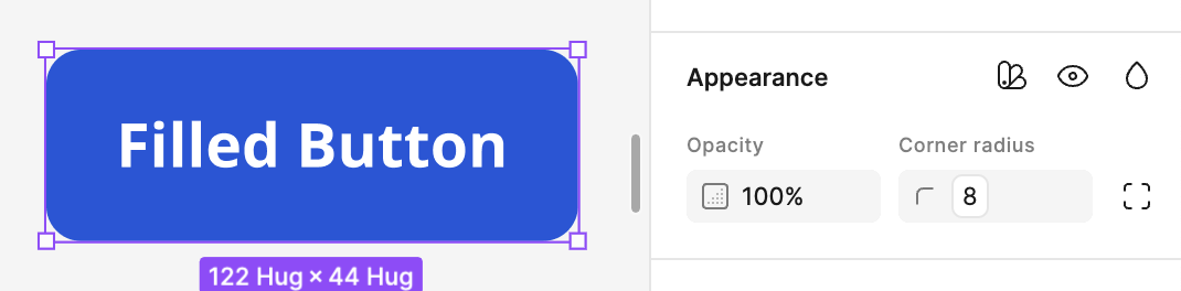
🌎 Button
🌎 Button
🌎 Button
🌎 Card
🌎 Card
🌎 Tooltip
🌎 Alert
🌎 Icon Button
Took component check in
We began with a component check-in process, auditing all existing designs that were queued for developer handoff. This involved reviewing each screen, validating component usage, and understanding the rationale behind previous design decisions.
During this audit, we identified areas where legacy or custom components were still being used. We then systematically replaced them with the newly built design system components, ensuring consistency and alignment across brands. As part of this migration, we also applied Figma Variables to enable seamless theme and brand switching, ensuring each UI could adapt to different brand identities without rebuilding components from scratch.
1
In the right panel click the "Apply Variable Mode" icon.
Page Level

Component Level
2
Choose Brand Group in dropdown #1: From “Semantic”, select the brand group based on the first letter of the brand you want.
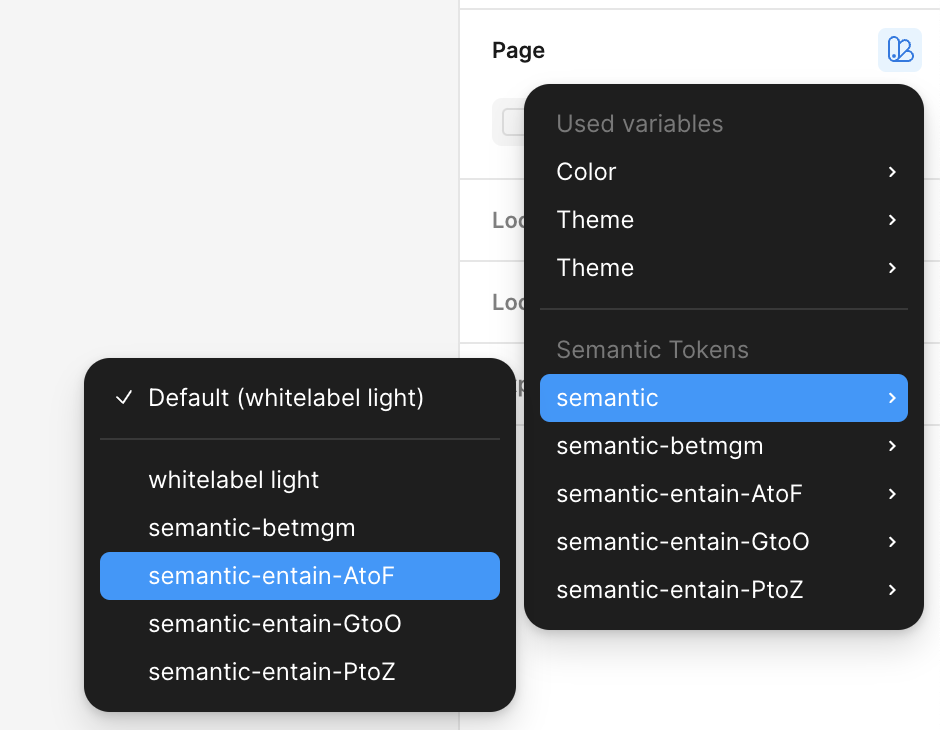
“semantic-entain-AtoF" for Entain brands starting with A-F

3
Choose Brand Name in dropdown #2: From chosen group, select the desired brand and mode.
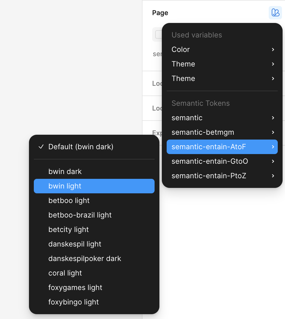
4
After applying the brands, your selections should appear like this:

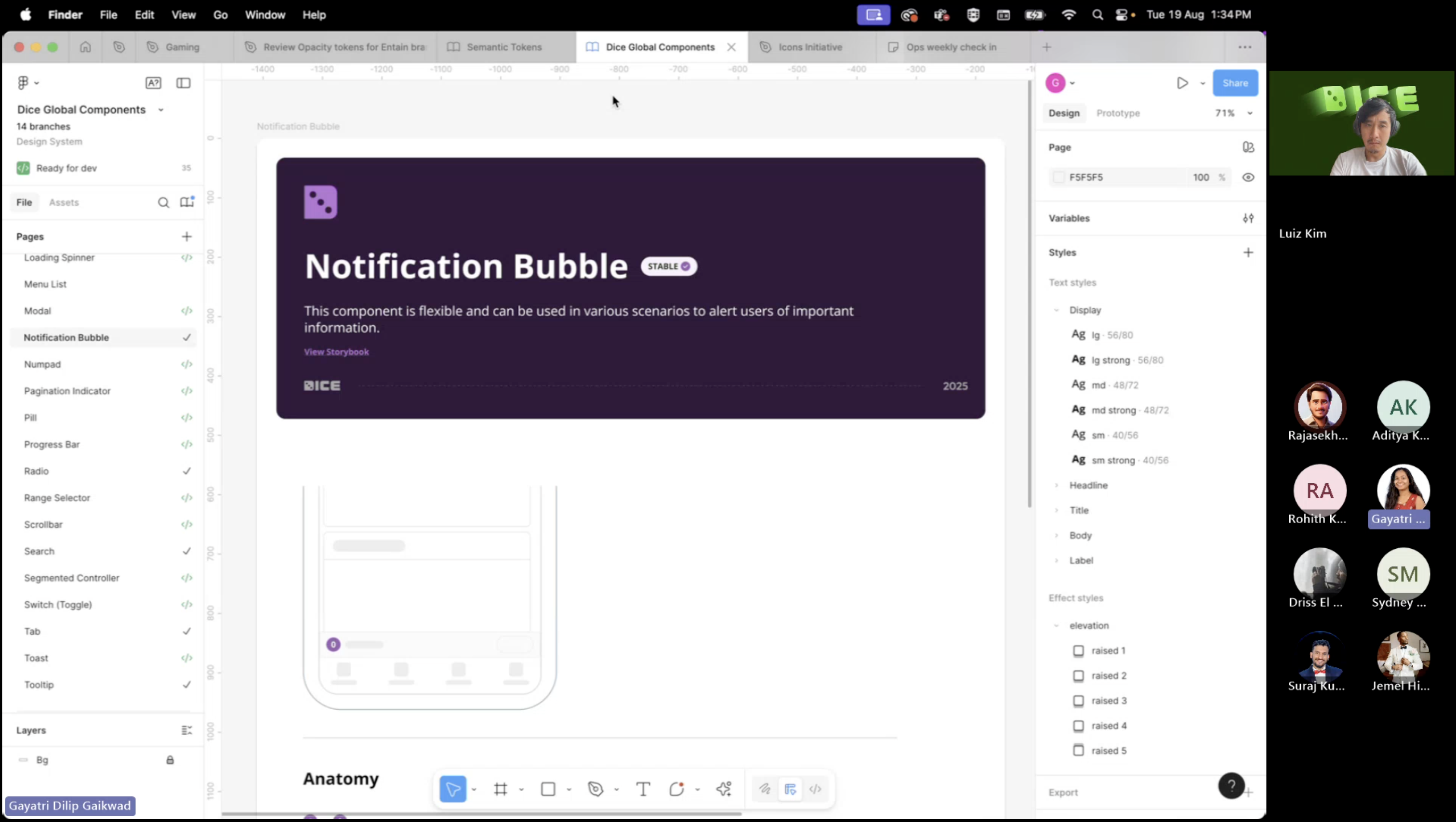
Pillars of our Design system
Switch Brands
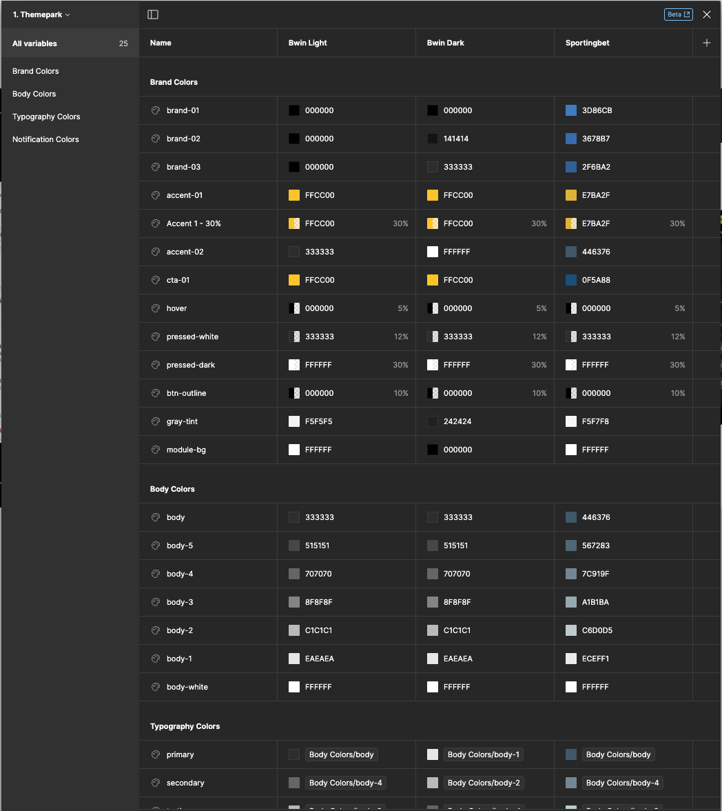
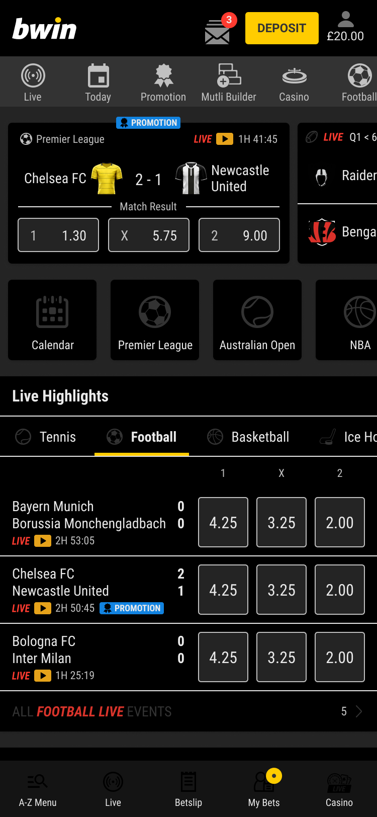
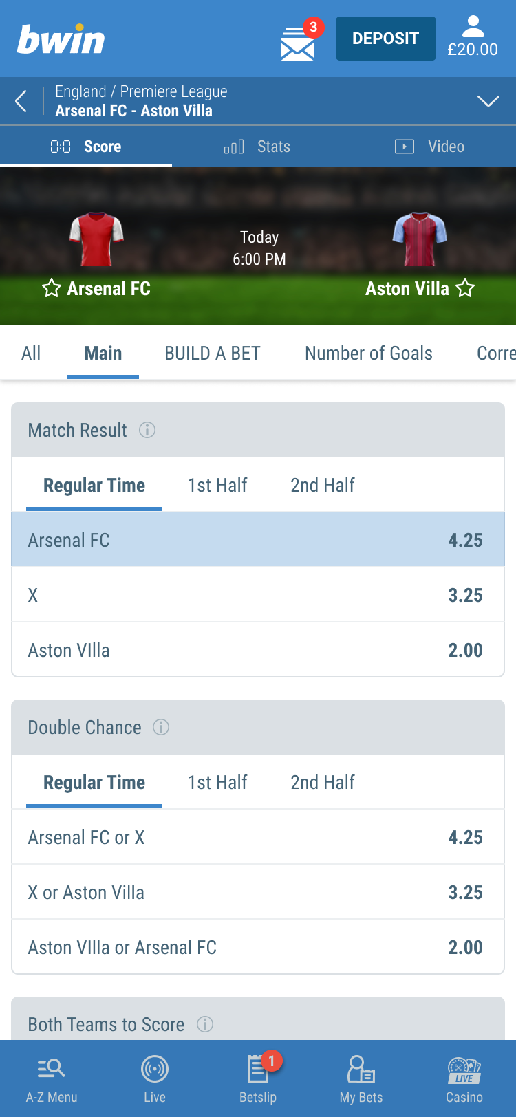
All components in the Dice Design System are mapped to semantic tokens, making it easy to switch between branding and styling. Variable Mode in Figma lets you apply brand themes to components or entire pages.
You can apply a brand at either the page or component level:
Page Level: Select the page you want to theme, then use the Apply Variable Mode Icon to apply the brand. This will update all components on the page to match the selected brand styles.
Component Level: To apply a different brand to specific components, use a brand layer at the component level. Components will inherit the page’s brand layer unless a specific brand layer is applied.
To change the brand for a page or component, follow the instructions to the right.
Pillars of our Design system
Nested Instances
Some components contain smaller child components within the Dice Design System. With Figma's "nested instances" feature, all properties are displayed in the Properties Panel, allowing designers to view and edit them without needing to double-click into each component.

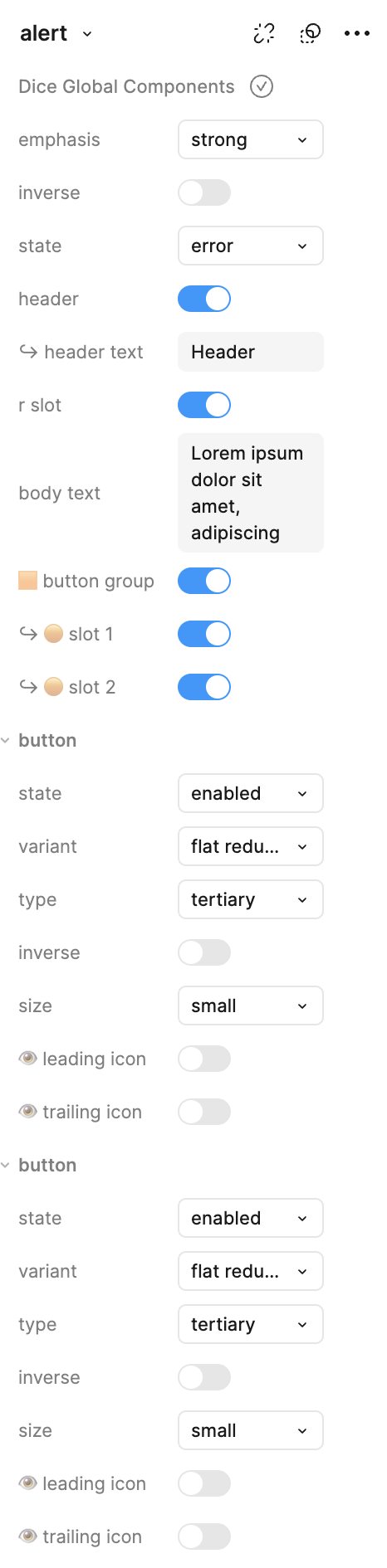
These are nested instances!
This "button" is already a component in the Dice DS and is embedded within the "alert" component. On the right, you can see its properties displayed as a nested instance!


Header
Lorem ipsum dolor sit amet, adipiscing elit. Ut interdum mattis nunc vitae lacinia. Nulla interdum, metus eget.

Flat Reduced
Flat Reduced
Deliver
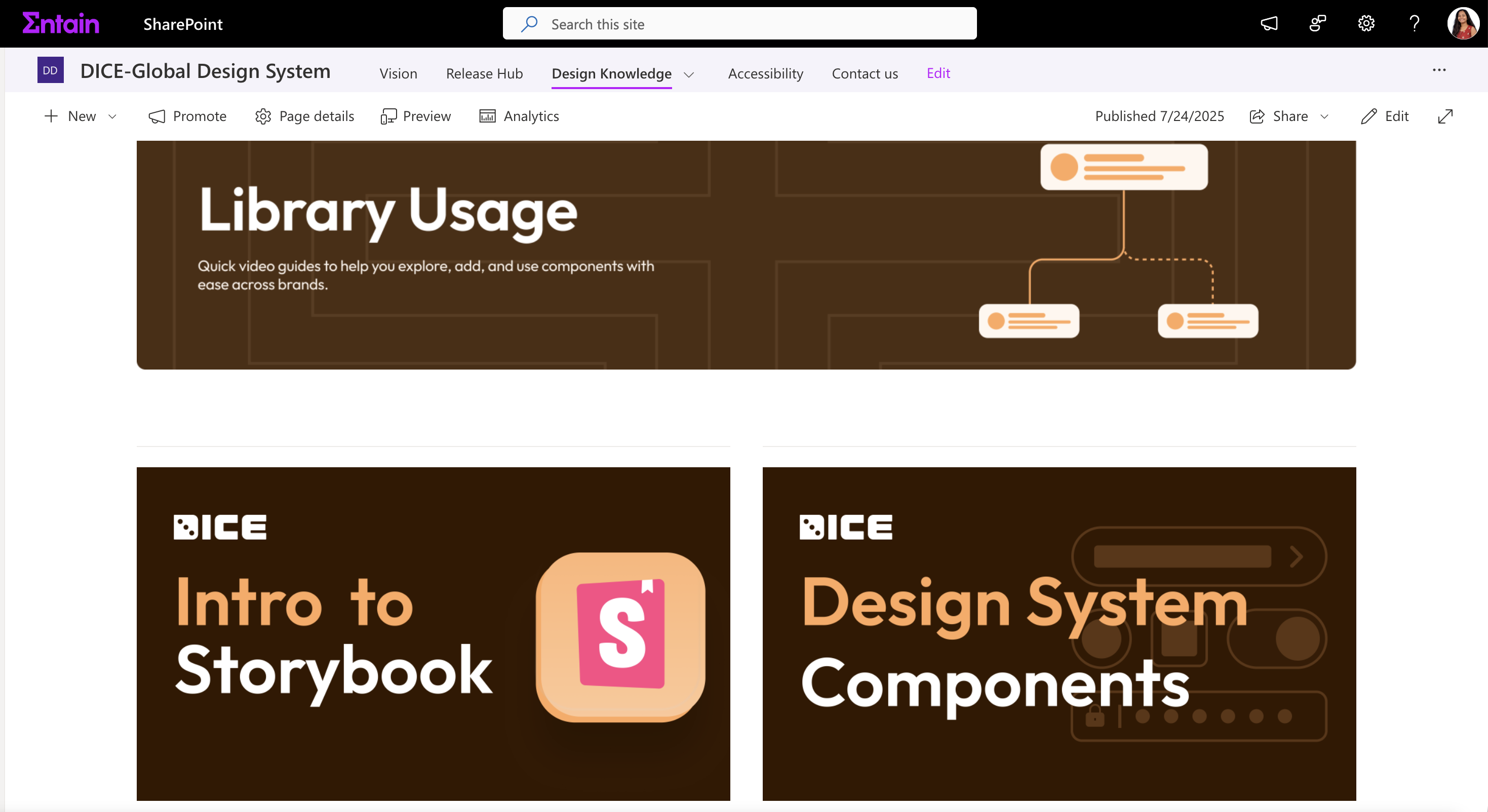
With the Dice system fully developed, the final phase focused on validation, rollout, and enablement. We launched the unified design system across teams, conducted onboarding sessions with designers and developers, and created a centralized documentation hub using Zeroheight to serve as a single source of truth for both design and development teams.
Documentation in Storybook about Dice Design System
Design System Knowledge Sharing
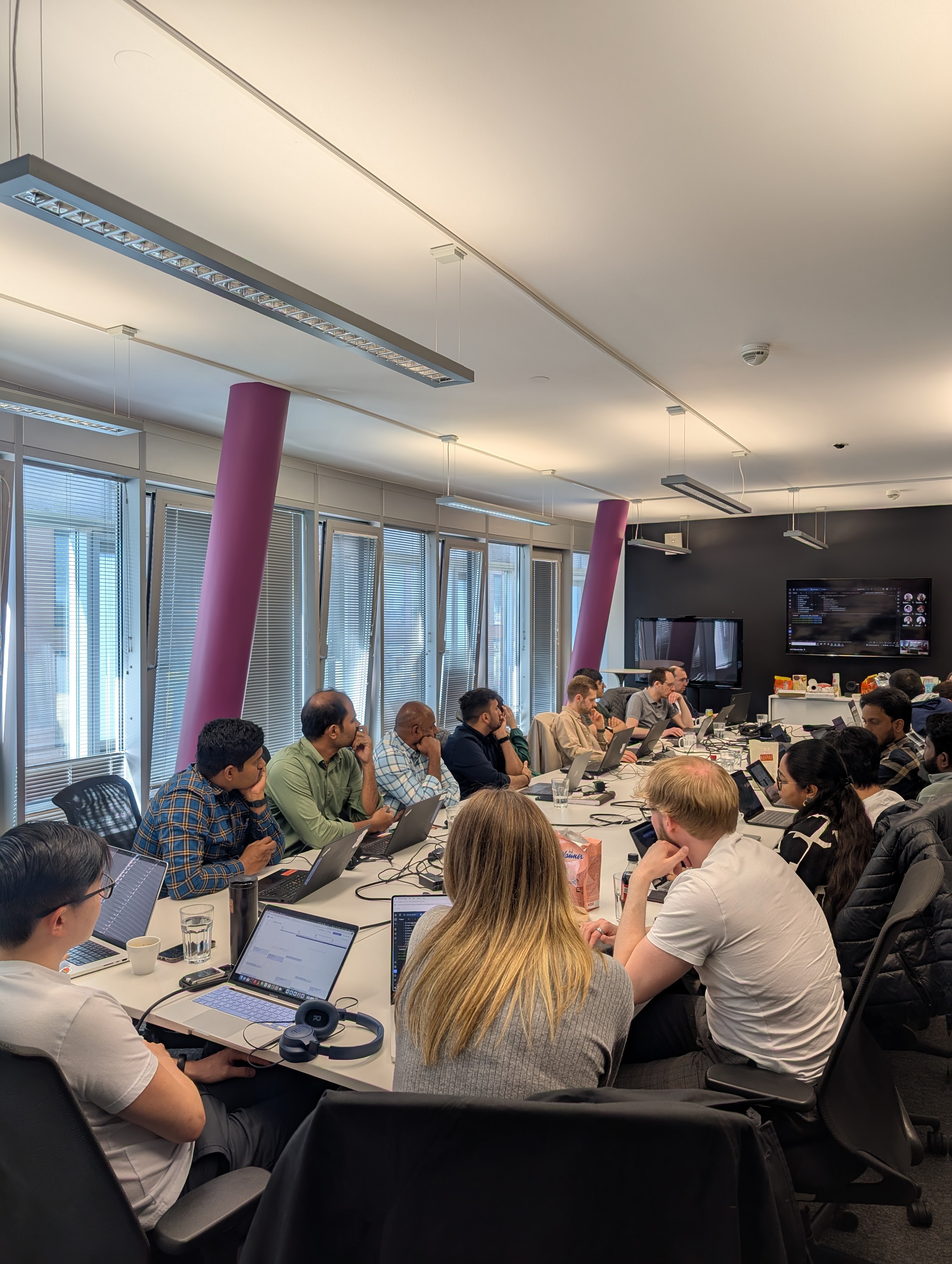
Rolling out a design system is only half the journey ensuring it’s understood, adopted and championed is where real impact begins.
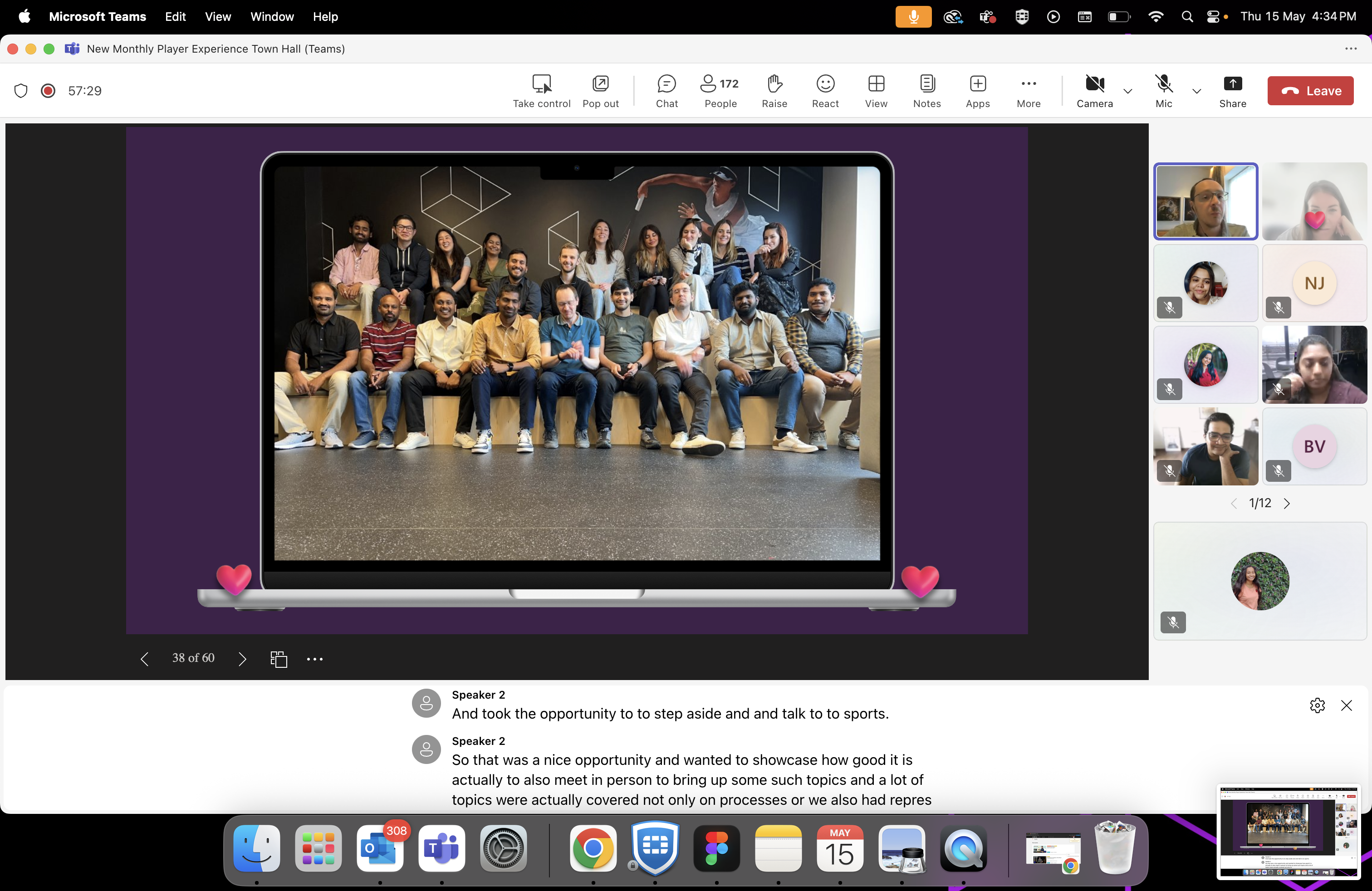
As a systems team, we took a hands-on, humans-centered. Hosted multiple townhalls in collaboration with our engineering partners to share the vision, showcase progress, and foster cross-functional alignment.
On the design front,out efforts are focused on education,enablement and ongoing collaboration:Conducted team-specific learning sessions to guide designers through the prinociples, structure and usage of the DICE system.Hands-on working sessions, giving designer the space and support to pratice with DICE in real design scenarios.In these early days, we’re also providing embedded support-collaborating directly with teams as they create new designs the ship using the system.To make knowlesge accessible long-term,we’ve created a dedicated sharepoint space where recording of this educational sessions are saved ensuring anyone can revisit them at their own pace,whenever needed.This phase is not just about adoption it’s about nururing confidence, encouraging contribution and creating a strong foundation for sustainable system wide design.
Before

DS Library

Sports DS
Library
Theming


...
Library
foxy
Party
Gala
Borgata
Betboo
Gamebookers
.....
WL
Library
themepark


DS Library
After

DS

WL mode
mode
mode
mode

mode
mode
mode
mode
mode

mode
mode
...
In Person Collaboration
Dice was never just about tokens and components - it’s about people working together.
During our onsite sessions, we sat down with engineering teams, product managers, and stakeholders to align in real time. These face-to-face conversations helped us:
solve challenges fasterAlign on shared goalsBuild stronger working relationships.These moments reminded us: the real foundation of a design system is collaboration.
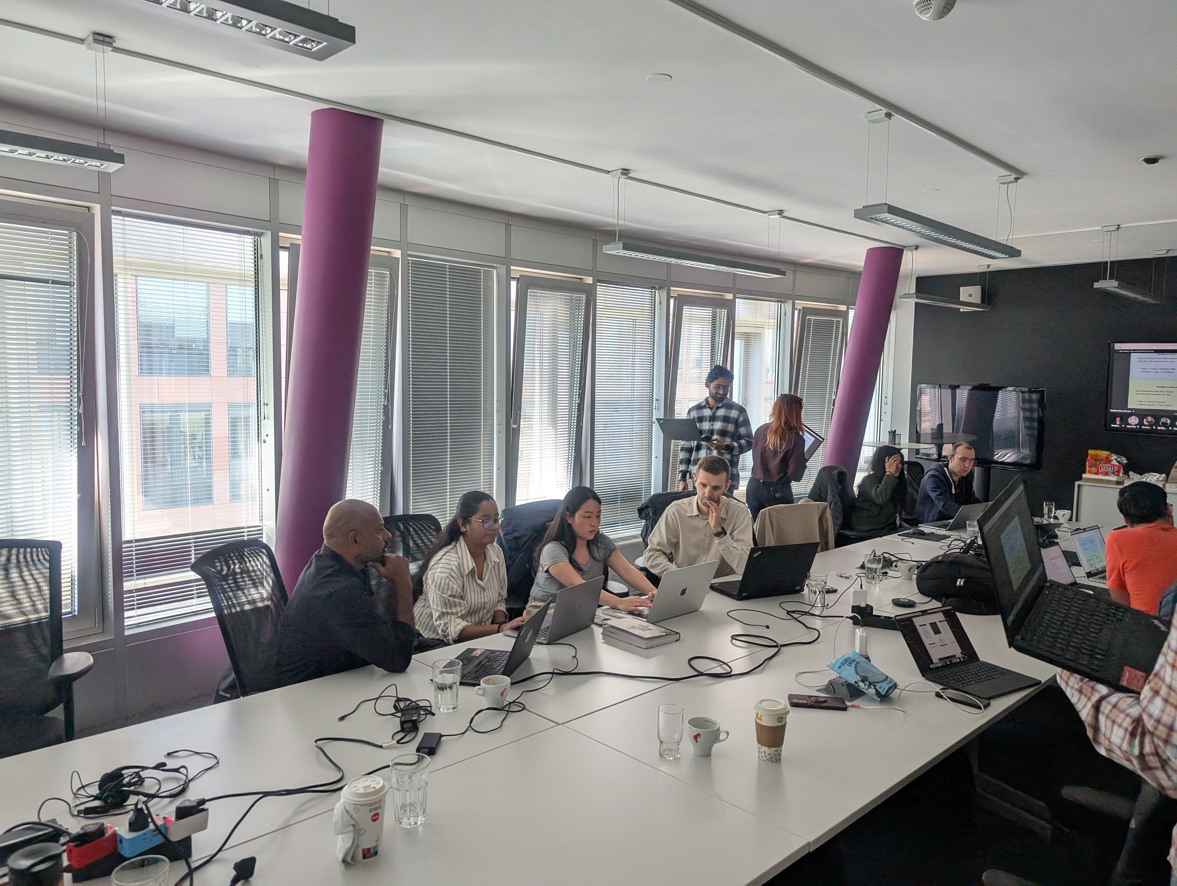
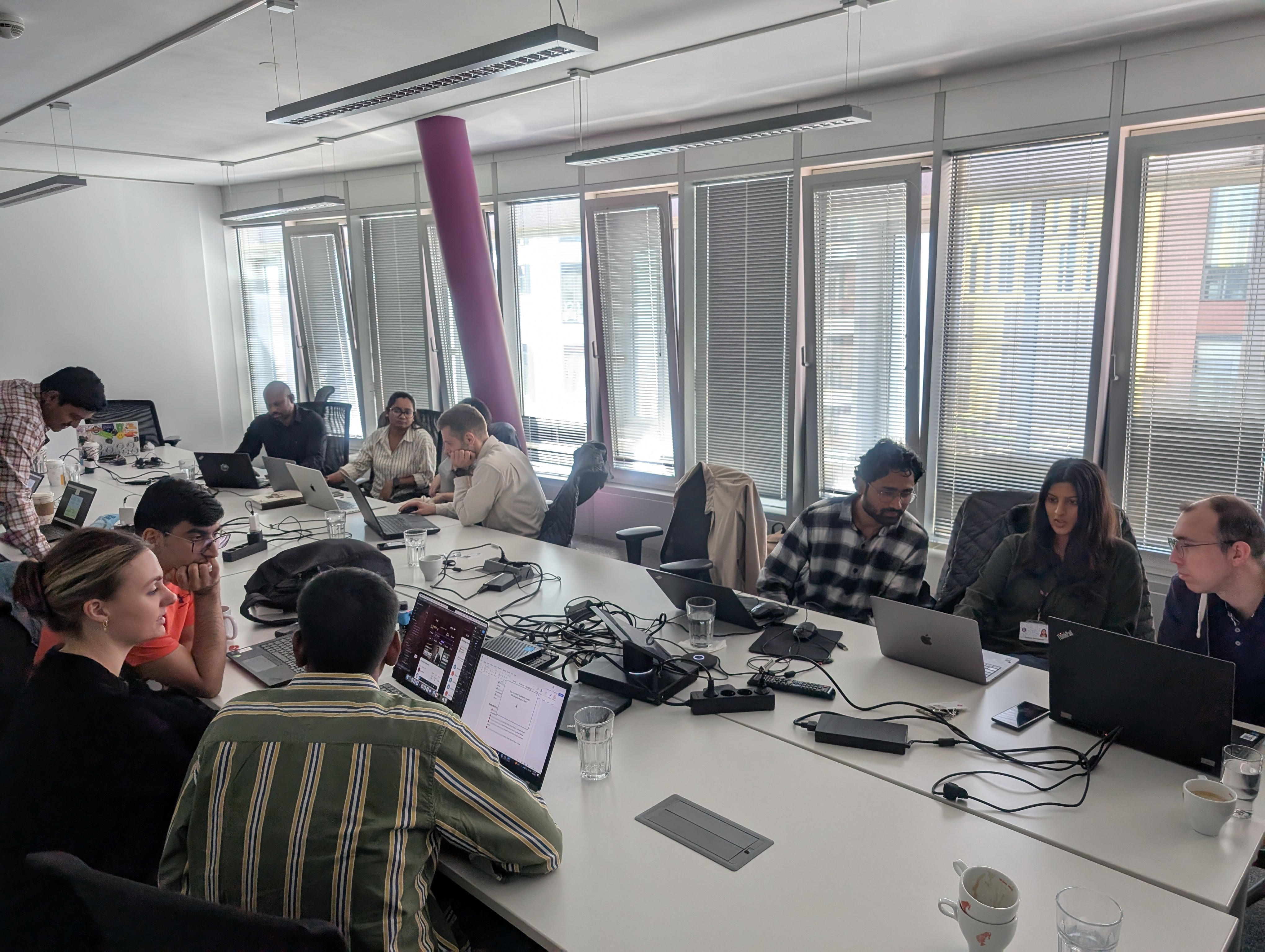
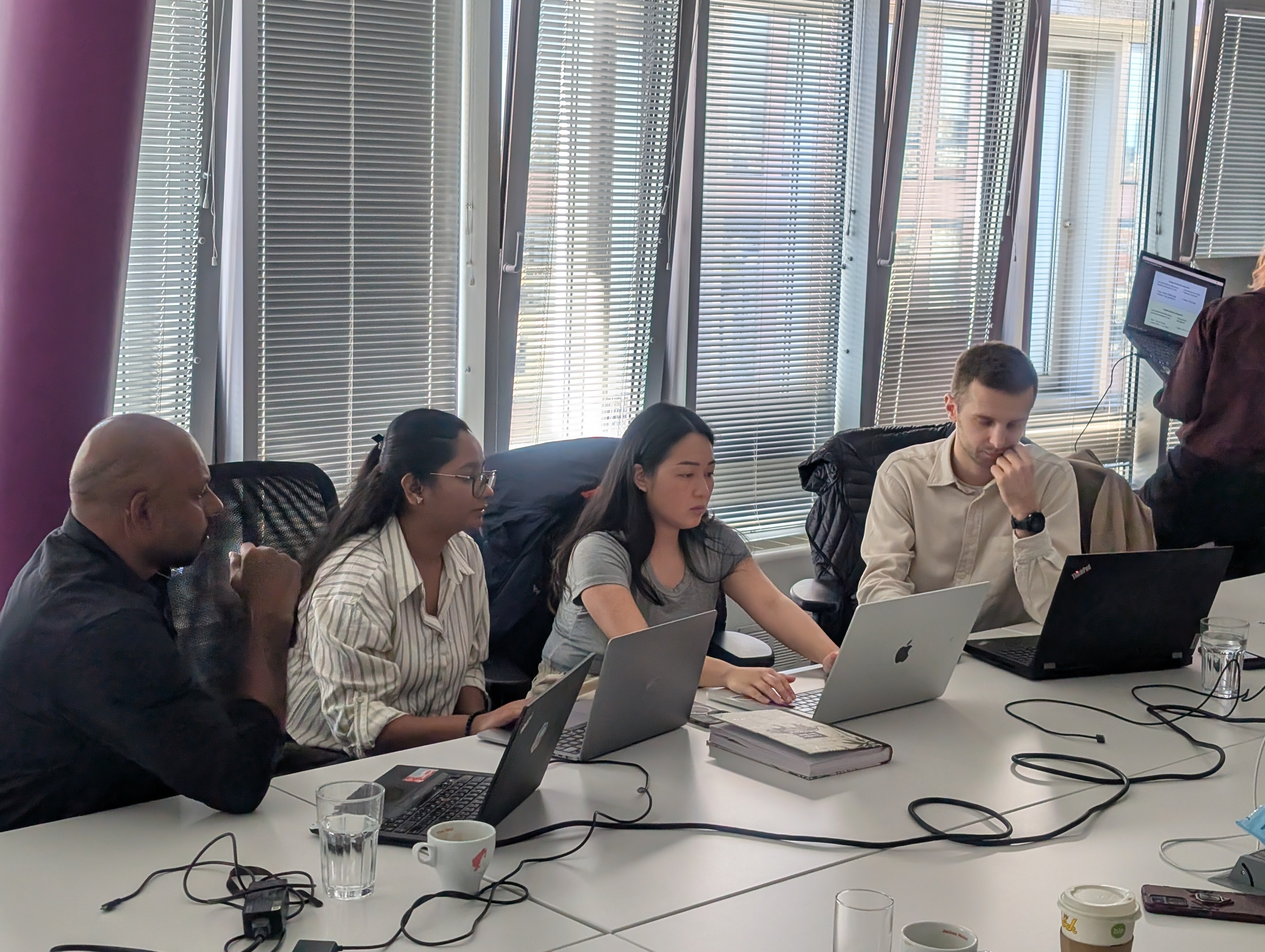
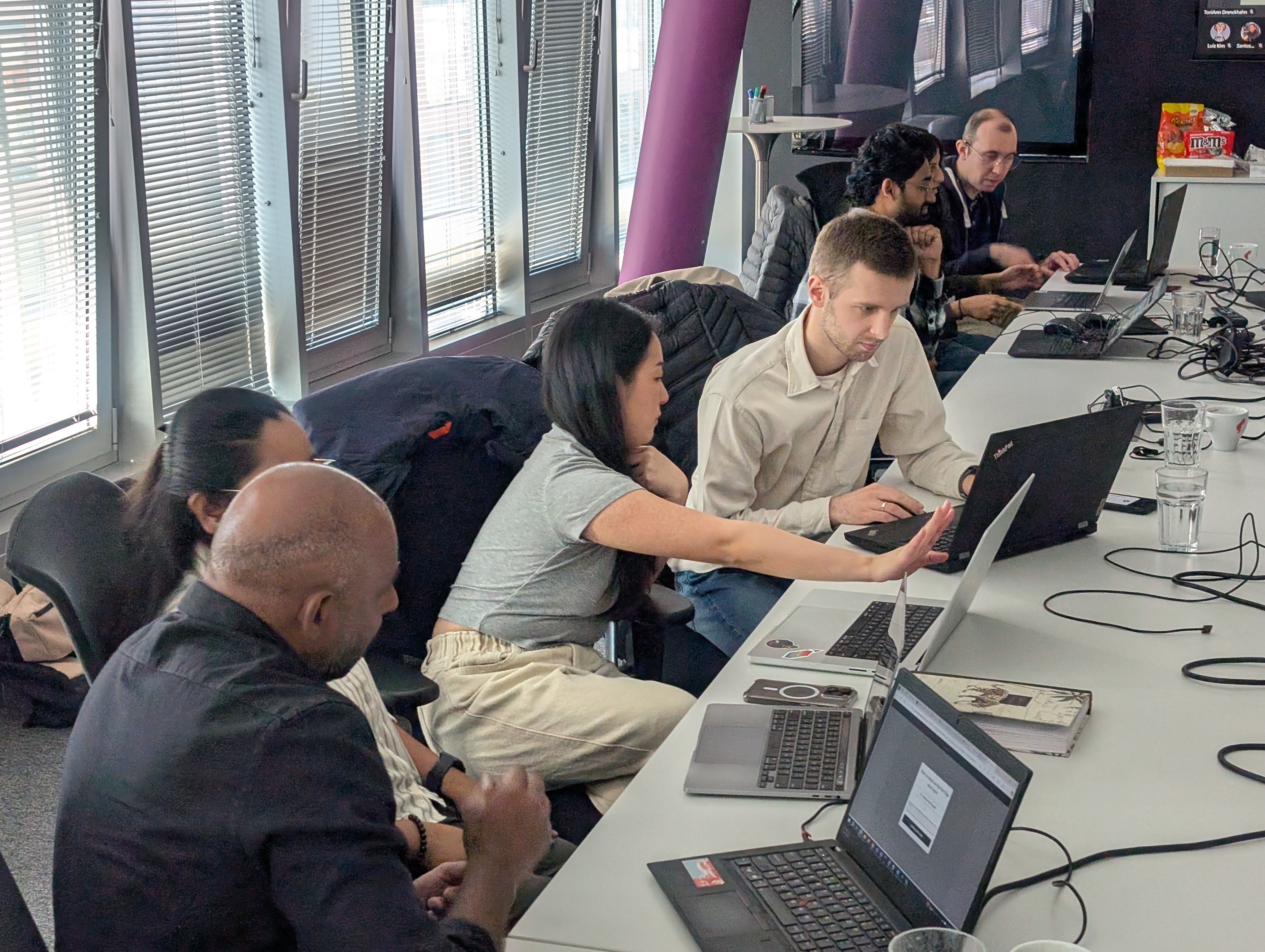
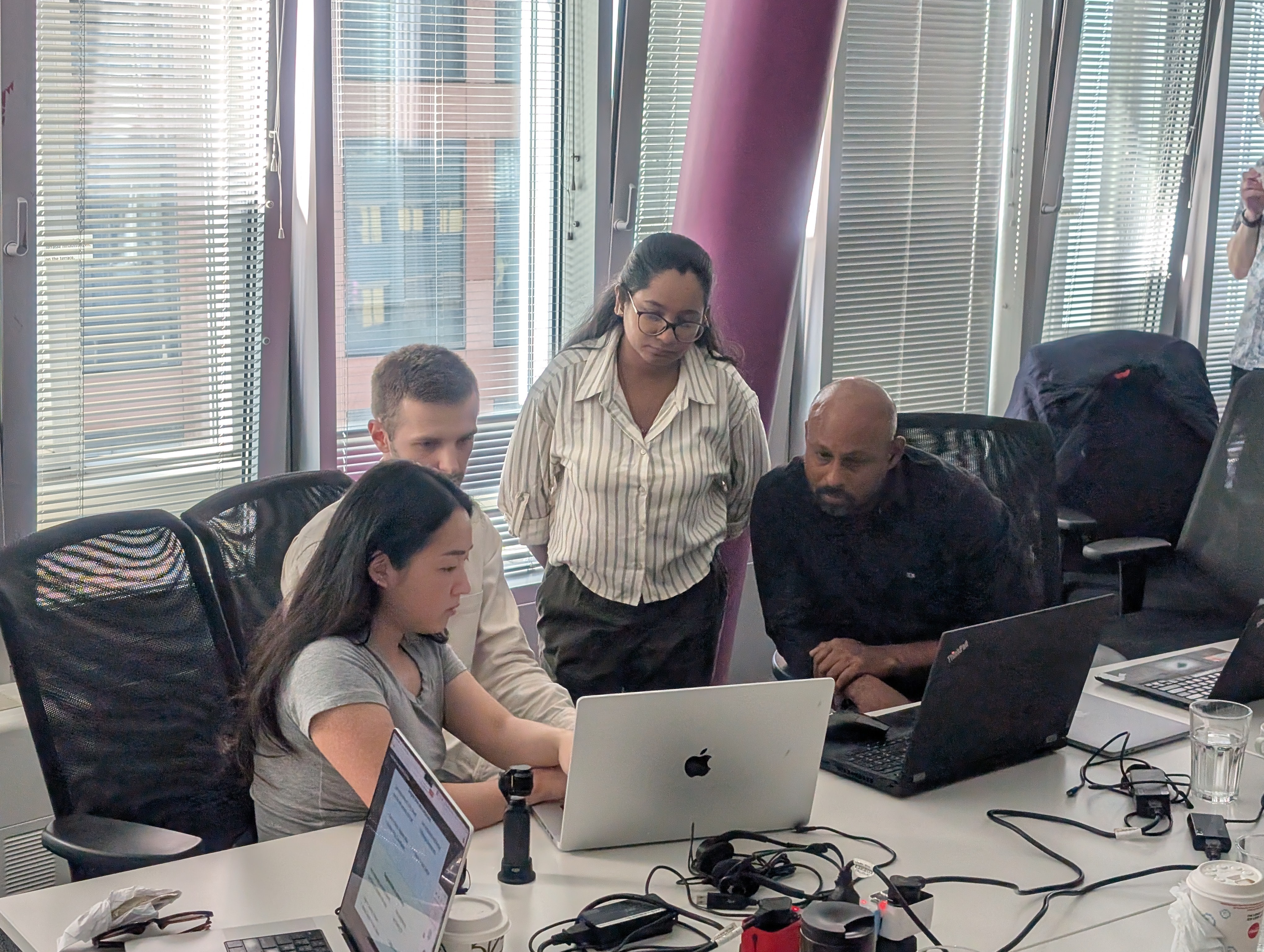
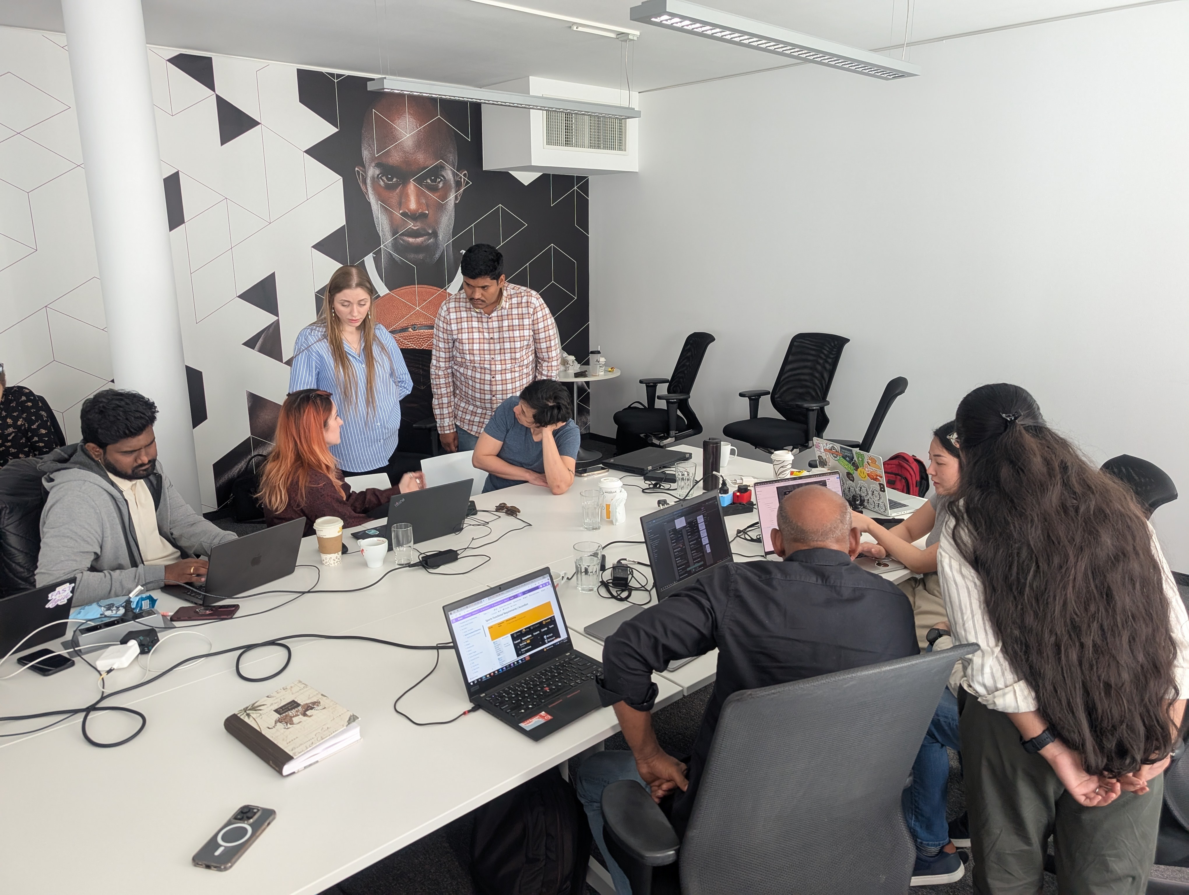
DS x Engineering x Product, Vienna - spring 2025
Learning - Building dice at scale
- Gained expertise in Figma Variables and scalable multi-brand theming
- Learned how to design systems that actively reduce design debt across teams
- Strengthened cross-functional collaboration by working closely with engineering, product, and brand teams
- Understood the importance of education, documentation, and advocacy to drive adoption
- If done again, I would involve engineering earlier in token planning to minimize rework and alignment loops
The biggest insight?
Design systems cannot be built in isolation.Success comes from collaborating early, aligning deeply with engineering, and treating stakeholders as co-creators not consumers.
Positive Feedbacks:
Now it’s just token switch, not component rebuild – Developer
Cleaner, faster, and finally standardised – Designer

Thank you
I’m always open to meaningful conversations, collaboration.
